Big Figment is a four piece indie rock (sorta pop) band from Brooklyn with a lot of funk and grit. They're a bunch of fun to watch, and they're pretty strange, interesting individuals in my opinion. You can listen to some of their stuff on their
Bandcamp site.
The image itself was inspired by a cousin of mine who was five at the time. He had a pretty wild imagination when we played pretend. One time we were under a table in his dining room and he kept saying we had to hide because of some large glowing creature floating above us. He described it loosely, like a kid usually does, but I was so intrigued by his "fear" of this thing that never existed. I'm pretty sure he was making it all up as he went along, but he had some pretty great details in it's features.
 |
| Kyle drawing with chalk describing a battle. |
I used tempra paint and gouache for the image itself. I grabbed some pretty vibrant fluorescent colors from DaVinci's Art Supplies Store near School of Visual Arts. These sort of colors DO NOT mix well with other colors. I think they are meant to stand on their own, and come straight out the tube/container on to the page.
The brand of tempra paints I used were cheap, and honestly not the best choice if you are going for high quality.
I did upgrade to the good stuff to use for future images.
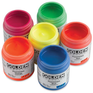
These acrylic paints by Golden are pretty dope.
They are much thinner in viscosity than your normal heavy body colors. Some colors feel more like a fluid acrylic paint. I'm not sure why that is, but it probably has something to do with the chemistry of these sort of materials to get that kind of vibrancy. These are colors you simply cannot replicate with regular paint, so you'll just have to deal with the lack of body they provide.
The other thing with these sort of colors is that they aren't terribly opaque at all, which is good and bad in a way. You don't really need water to do "washes" with these guys. If you want an opaque, solid color you'll have to build it up with layers.
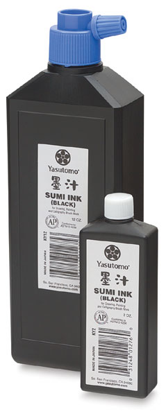
For the Big Figment logo I hand drew the text with Yasutomo sumi ink (the waterproof kind) on regular printer paper. I do a bunch of different takes. Sometimes I gotta Frankenstein a logo together because I like how certain letters come out on some takes, but not so much the other ones. I'm pretty impractical when it comes to designing typography.
Hand drawing typography reminds me of recording music. If you fuck up a section, don't cry about it, just punch in and fix that section. I do the same thing with designing type. I have piles of failed attempts going for the one shot kill, but rarely do I have that magic moment when it all flows out beautifully. Thank god for Adobe Illustrator and the live trace tool. Once your type is scanned you can digitally manipulate everything far more easily than you ever could on paper.
The "BIG" was done on the back of a time sheet. Like I said, just regular printer paper, scraps, anything to write on to get the idea out. Once it's down, you scan, and can work on it on the computer. Ain't technology swell?
Once live trace is used on Illustrator you can "expand" and then make any alterations needed. Then you have the ability to do all sorts of cool shit like change the color, the size, the effects used (glow, shadow, etc.) You pretty much do whatever the hell you want with it.
Words of advice!
- If you are going to be making hand drawing type: Use the darkest black paint, black markers, black pens, black pencils or whatever you use because live trace will have a much easier time picking up pure black than anything else.
- Try to avoid smudges that fall into grayscale, they don't really reproduce well as a vector with live trace.
- Use white paper only! Once again, it just makes it easier for the live trace tool to translate your real life image into a vector image.
- If you are using a grid, make sure it's the non-photo-blue kind! It's a real pain to delete a bunch of skinny little black vector lines from the grid, so get the kind that won't reproduce after scanning!
- Live trace isn't going to make everything perfect. Sometimes straight lines come out wobbly. You'll have to make adjustments yourself, so don't think it's gonna do everything for you!


