When I was at my previous job doing internet marketing, I had these cool co-workers that I bonded with pretty early on. I met them tonight after not seeing them for while and made them these FRED the Shark watercolor paintings. FRED was our personal mascot (our champion through dark times) who happened to be a rubber toy shark. I brought him to life with a voice that was sort of raspy and southern sounding (I don't know its just something that came up naturally). I ended up making a bunch of drawings of FRED for my co-workers. They enjoyed them immensely, and I decided that I would make an extra special reunion edition for them.
Here is FRED in all his glory:
FRED based off of the 1931 classic Fritz Lang film, M.
FRED as a Roman Emperor, who could ask for a better dictatorship?
...who dresses up our action heroes in this sort of garb. I'm tired of the "bad-ass" look in films, it just breathes douchey lameness all over the screen.
But imagine a ridiculous gun fight with a man dressed in this:
Now that would be cool....
I know some of you can't visualize this sort of awesomeness, so I took the liberty of add some extra effects for you:
It's always good to have a picture to refer to when constructing this little bad boy.
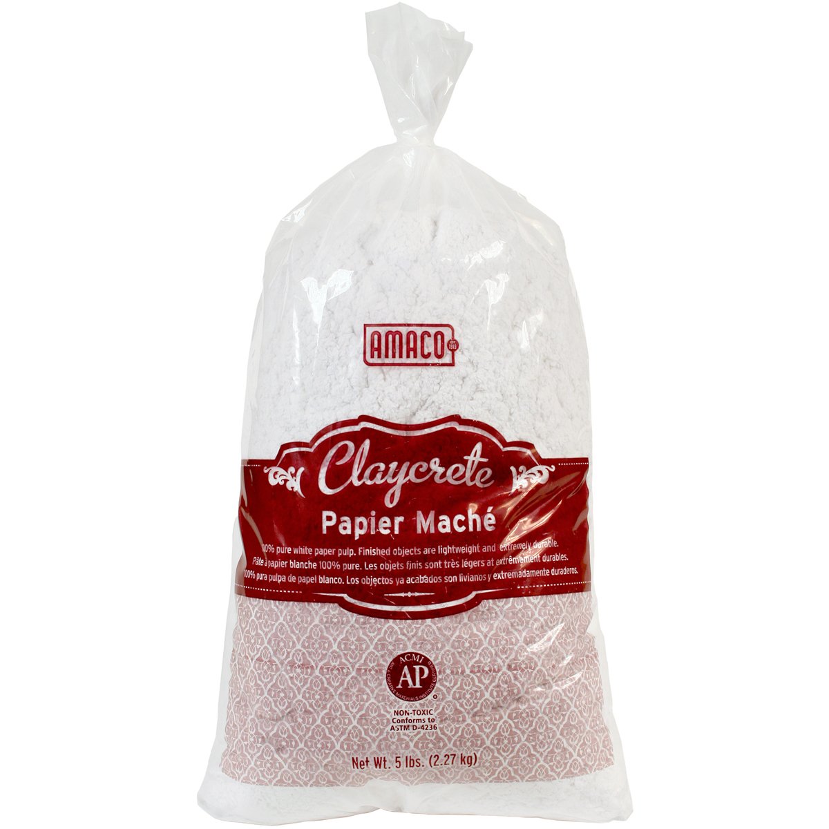
Then I papier mache the exterior giving the general mold of the creature using Claycrete.
All you do is add water! Super simple and great quality.
This is still a really messy process, so make sure you have some disposable surface to cover your table when working with this stuff! It took about a day for it to harden and dry completely. It'll probably take longer if the weather is humid, try to keep it in a dry warm place.
I used AMACO Sculptamold after the Claycrete paper mache finished drying to give it a smoother finish.
The cool thing about Sculptamold is that once it dries and hardens you could actually sand it down. Unfortunately, I didn't have enough time to sand down for a smooth surface since I only thought of making my costume three days before Halloween.
Damn it Giger, stop making things that looks like a penis!
Nathalie, my wonderful costume designing girlfriend, helped me with the shirt. She's very very good with details, particularly on the logo patch and blood.
I whipped out my Iwata Eclipse air brush to give the creature it's first coat of paint.
The airbrush is very efficient in getting into all the nooks and crannies than with your typical paint brush. I mixed some fluid acrylics that were designed for airbrushes to get a fleshy color. I mixed white, red, yellow, and a drop of blue. It didn't have to be perfect, since the finishing layers were going to be with regular paint brushes and heavy body acrylic paint.
Looks like a freshly baked loaf of bread.
This is how it looked after mixing and painting with a paint brush.
I painted the teeth on a separate piece of cardboard and later installed it from the inside of the cardboard frame.
I forget the last time I've been to the dentist.
Mixing all different kinds of flesh colors helps this papier mache chestburster come to life. Looks absolutely gross!
But something is missing...
I feel like I'm missing something...
Oh yeah!
Blood. Lots and lots of blood.
This is how it looked like when assembled. It took a lot of duct tape, and a piece of string to keep that papier mache prop supported on my chest.
MY RIBS!!
It was a hit at the Halloween parade, particularly with African American and Hispanic women... there is something about large phallic symbols that just get 'em going, they're so weird...
Every so often I like to see how my blog is being discovered by people's searches. Sometimes they make sense, they type Alex Ariza in hopes of learning more about Pacquiao's (the Filipino allstar boxer) trainer. Then there are searches that kind of make sense, drawings of the Brooklyn Bridge, Sleep Paralysis Women, The Mars Volta, The Smiths Suck...etc. etc.
and then of course we have this...
Yeah, you read that right...nightmare before christmas sally as a slut. I had uncontrollable laughter when I saw that. How that search pulled up my blog is beyond me. Doesn't make any sense to me whatsoever.
I felt compelled to satisfy the needs of horny emo/angsty/loser dudes who want to see that beloved Tim Burton character whore-ified. I picked up a discarded piece of cardboard and had at it. Felt good to paint that way, quick and enjoyable...almost how those boys will...oh nevermind.
Anyway, here's the painting of Sally (from the nightmare before christmass) as a very well endowed slut. Used acrylics this time instead of gouache, it's nice to change mediums every so often I guess.
FUN!
This is NOT fan art. I hate fan art.
This is probably how Jack Skellington would react if he saw those new and round undead chest puppies on his woman.
Queens College has a pretty kick ass looking art building.
When I first started going to Queens College, I wandered a lot around campus. A lot of the campus holds pretty ugly crappy looking 1970s-80s modernist buildings that I cannot stand to look at. When I
"discovered" Klapper Hall, I immediately walked inside to find out what this beautiful building was for. I found out that it was the college's Art Department building. I took a stroll in and out of classrooms to see what kind of work was being produced by the students. Eventually, I wandered into a gallery space. It was a legit space. High ceilings, white walls, and wooden floors, what more can a man want? The gallery space was used to exhibit student work. A sort of envy came over me. FIT never had any proper viewing space for their student's work. How is it that a normal Joe Schmoe college have a gallery space, and an art school not have any space available for their students?
I made it a point to find out how I can get my work to be hung on those Queens College gallery walls. I learned about a show that was going happen in October. The submission date was sometime in late September. I gave it a try, I went out bought frames, made mattes myself, and even tried making a new piece for the show itself.
Unfortunately, the new piece didn't get in. Guess it didn't look as finished as the other ones. At least I can take it back home and work on it some more.
Here's how they all looked framed
The opening reception is on October 5th from 5:30pm-7:30pm at Paul Klapper Hall.
I'll probably check it out early on, but won't be able to stay since I'm seeing a Portishead concert later that night.
Went back to school. Attending Queens College, majoring in Technical Theater (set design, lighting design, etc.) and minoring in Music (always wanted to learn music proper). I still draw, I just don't post as often as I should.
Death of a Phoenix
The colors in this photo don't represent the actual colors of the piece...damn shame.
If you've never watched Stanley Kubrick's, A Space Odyssey: 2001, then you are missing out on one of the best films ever made. This film was made in 1968 and till this day looks fresh and cutting edge. The music for the film really made it all the more amazing for me.
Gyorgy Ligeti's Atmosphere was a fantastic beginning and had me mesmerized from the very beginning of the film.
I became a huge fan of his music after watching the film.
Here is a portrait I did of him with the iconic monolith behind him.
Portrait of Gyorgy Ligeti Graphite, Ink, and Digital Drawing 2011
I made this as a Birthday gift for a friend a while back, I just recently found my old flash drive with a bunch of scanned images from my college/just out of college stage. I used to be so much more into this whole art thing...
Bunny Girl Watercolor and Gouache on 5 x 7 in. Paper 2010